

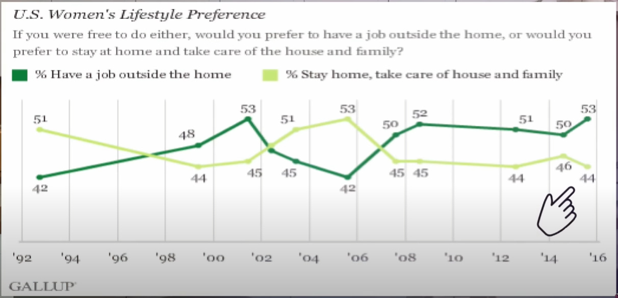
Just look at it. Admire it. It appears to chart epochal shifts in the life aspirations of women. The two lines dart and weave past each other again and again, as if two camps were locked in a titanic struggle — crises of generational succession — bitter elections held — it’s magnificent. It’s television.
The timescale, of course, spans not generations, but only two and a half decades. That should give one pause. Are women really as changeable as the weather? I hope the reader will grant that ten percent of all women probably did not swing from wanting a job to wanting to stay home in the span of two years, nor did they swing back a little later in the span of three. Our magnificent graph must be, in fact, a very tasteful artistic rendition of statistical noise.
Neglecting the modest percentage of women who chose neither option, the results of each individual poll will have a binomial distribution about the true mean. This may sound technical, but really it’s tautological: every poll with two options will follow such a distribution. Binomial distributions are therefore well understood, and we can use that understanding to learn some interesting facts from this noise.
For example, here’s a neat trick: without even looking at Gallup’s experimental methods, we can use the graph to estimate their sample size. Each line swings about five percentage points either way (a spread of ten percentage points). Assuming this to be the size of a standard deviation, we can conclude with some confidence that Gallup only surveyed about a hundred women each time.1 This is a very rough calculation, but it gives us an idea of the magnitude of these numbers.
One hundred women, as we can see, is really not enough to get a good estimate of the true percentage in the entire population. But eleven hundred, it turns out, is pretty good. So, by taking the average of the individual values across each line, we can see that the population is likely within a couple percentage points of a perfect 50/50 split.
That, again, should give one pause. On the face of it, there’s no obvious reason why the population would split exactly down the middle on this issue. And there should be a reason. The 50/50 male/female split of most mammalian species, for example, is the result of our sex chromosomes, coupled with selective pressure against any deviation from 50/50. The roughly 50/50 Republican/Democrat split of U.S. politics is the result of a system deliberately engineered to be balanced, and constantly maintained by pressures on and from each party. If we call such a two-party system broken, we should remember it’s broken by design, cracked exactly in half.
Not so for opinions and lifestyle choices like these. What percentage of people have seen multiple MCU movies in theatres? It’s probably not 50%, simply because there are one hundred other numbers to choose from. What percentage consider themselves feminists? What percentage are business owners rather than employees? These numbers are much more likely to skew all over the place. And yet here we have a nice, clean 50/50.
And herein lies the crux of the issue, and what I find so amazing about this graph. One can contrive various elaborate mechanisms that might keep the balance between aspiring independent women and aspiring stay-at-home mothers. For example, maybe when one side is “winning”, there’s pressure to switch to the “losing” side and shore it up. But I find all that a little far-fetched.
No, there’s a much more obvious mechanism for getting results like these: maybe most women are completely indifferent between the two options. They see no real difference, for their own purposes, between one and the other. And yet, of course, this is the sort of thing one should have an opinion on — surely? And so rather than pick “other” (a rather vague and threatening choice) or “prefer not to say” (why so cagey?) they simply pick at random. Such choices don’t feel random, of course: we usually come up with some kind of ad hoc justification. But they aren’t deeply held, strenuously considered choices. They are as meaningful as the choice between a red and a blue sweater.
In other words, our magnificent Gallup graph, twenty-five years in the making, is a study of a non-issue. It is television — tuned to a dead channel.
And I leave this discussion here, with an exercise for the reader: what does this say about democracy? Elections can have real importance when real stakes are on the table. But for the majority of people, how often does that really happen? If you have a comfortable life, a stable job, and politically apathetic neighbours, how strongly can you really feel about, say, tax policy or the environment? Are you going to agonize for months and come to a deeply-held moral conviction about which candidate to choose? Or are you simply going to pick which sweater to put on?
Addendum: For those wondering, I pulled the graph from a YouTube video that did not cite its sources. I was not able to find the graph depicted in this form through Gallup, but through similar Gallup articles I was able to corroborate that the data presented is authentic.
Actually, this is complicated by the fact that we have assumed an unbiased sampling of the population. If the sampling is biased, and if the bias varies from poll to poll, the sample size might be significantly higher. But the net result is the same.